 By Antonio De Rosa, ADR Studio.
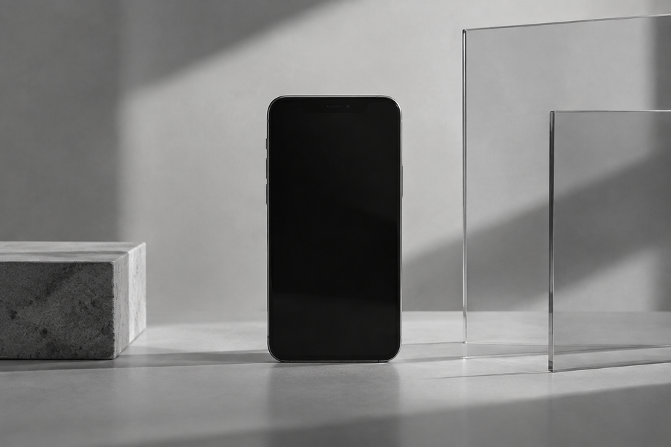
Apple Liquid Glass design needs a clearer purpose because a shared visual language should help people understand and use products, not simply recognise them. Our view is that its value depends on whether transparency, depth and motion explain how the interface works.
Apple’s Liquid Glass software redesign has brought renewed attention to the role of visual identity across its products. Translucent surfaces and responsive controls give its software a recognisable material language. The design question is what that language contributes after the first impression.
For us at ADR Studio, this is a product and brand strategy issue. A visual system earns its place when it connects expression with behaviour. Looking related is useful. Working together is what makes that relationship meaningful.
What should Apple Liquid Glass design achieve?
A cross-device design language should reduce the amount people need to learn. A familiar control should suggest a familiar action, even when the screen size, input method or task changes.
That does not mean every interface should look identical. A watch offers a brief interaction. A phone supports quick decisions and focused tasks. A desktop often carries several activities at once. Shared principles need room for those differences.
Liquid Glass gives Apple a way to express continuity through material, layering and movement. The opportunity is to make those qualities informative. A surface could signal that controls sit above content. A transition could explain where a panel came from and how to return.
The material should communicate a relationship, not just create an effect. When the same treatment appears everywhere, regardless of function, it risks becoming decoration rather than guidance.
Why does a software redesign matter to Apple’s brand?
Software is a daily expression of the Apple brand. People encounter it while replying to messages, checking directions, editing documents and managing their devices. Those repeated moments build an impression that advertising alone cannot sustain.
A distinctive interface also gives marketing a visible story. Screenshots and demonstrations can show a change immediately. That makes a new visual language useful for communicating product development, particularly when the physical device remains familiar.
But visible change and practical progress are different things. A launch can explain what looks new. Continued use reveals whether that change makes the product feel coherent, predictable and worth learning.
Our position is straightforward: brand expression should reinforce the product promise. If the promise is ease, visual richness should not make an ordinary action harder to find. If the promise is continuity, familiar behaviour should survive the change in appearance.
When does transparency help an interface?
Transparency can preserve context. A temporary panel may let someone keep a sense of the content beneath it. A floating control can remain visually connected to the image, map or document it affects.
It becomes less useful when the background competes with the foreground. Photographs, moving content and dense documents create very different conditions. A surface that looks calm in a demonstration may feel busy in everyday use.
The question is therefore not whether transparency is good or bad. It is whether a specific layer needs it, and whether the treatment remains useful as the content changes.
- Context: Does the surface help people understand what remains underneath?
- Hierarchy: Is it clear which element needs attention?
- Behaviour: Does movement explain a change of state?
- Restraint: Can the effect recede when the task needs concentration?
These are design questions that can be tested with real tasks. They move the discussion beyond personal preference without pretending that visual character has no value.
Should every Apple app use the same visual treatment?
No. Consistency should establish shared expectations, not flatten the character of every activity. Reading a long article and adjusting an image need different balances of content, controls and space.
A useful system separates stable conventions from flexible expression. Navigation patterns, control meanings and feedback should feel related. The visual emphasis can adapt to the task and the amount of information on screen.
This matters for developers as well as Apple. Independent apps need to feel at home on the platform without losing their own identity. Adopting every visible effect is not the same as understanding the system.
Our advice is to begin with the user journey. Identify where platform conventions reduce uncertainty. Then decide where the app needs a distinct voice. Systems, not styles, means having reasons for both alignment and difference.
How should teams assess a visual redesign?
Start with a product hypothesis, not a mood board. For example: a revised toolbar should make editing actions easier to locate while keeping attention on the document. That statement gives the team something concrete to evaluate.
Then compare the redesigned experience with the existing one using ordinary tasks. Observe hesitation, mistaken selections, recovery and completion. Ask people to explain what they expected a control to do, rather than only whether they liked its appearance.
Test the unpolished conditions too: long labels, crowded screens, unfamiliar content and interrupted workflows. A design language needs to work outside a carefully arranged presentation.
Marketing should follow the same discipline. Show what the change helps someone do. Explain a useful relationship between devices or a clearer interaction. Visual novelty can open the conversation, but it should not carry the whole argument.
For Apple, Liquid Glass is an opportunity to connect a recognisable identity with coherent interaction. For other product teams, the lesson is not to copy the surface. It is to define what their own visual language must accomplish. Design drives performance when that connection can be observed.
Key takeaways.
- Apple’s shared visual language should make products easier to understand, not only easier to recognise.
- Transparency and motion need a role in explaining context, hierarchy or behaviour.
- Cross-device consistency should preserve familiar expectations while adapting to different tasks.
- Evaluate redesigns through everyday use, then build the marketing story around demonstrated value.
FAQ.
What is Apple Liquid Glass?
Liquid Glass is Apple’s software design language built around translucent, glass-like interface elements and responsive visual behaviour. It provides a shared direction across its platforms, though the experience varies by device and context.
Does Liquid Glass make Apple products easier to use?
That cannot be assumed from appearance alone. It can help where layering and movement clarify an interaction. Its practical value needs to be assessed in specific tasks, with varied content and established patterns of use.
Should brands copy Apple’s glass-like interface style?
Not without a functional reason. Teams should first define their users’ needs, platform expectations and brand character. Borrowing a visual effect may create familiarity, but a coherent product requires clear rules for when and why that effect appears.