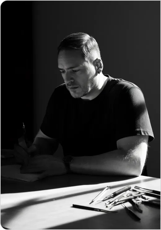
 By Antonio De Rosa, ADR Studio.
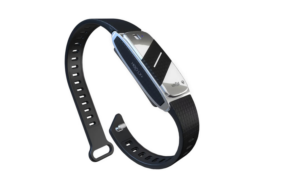
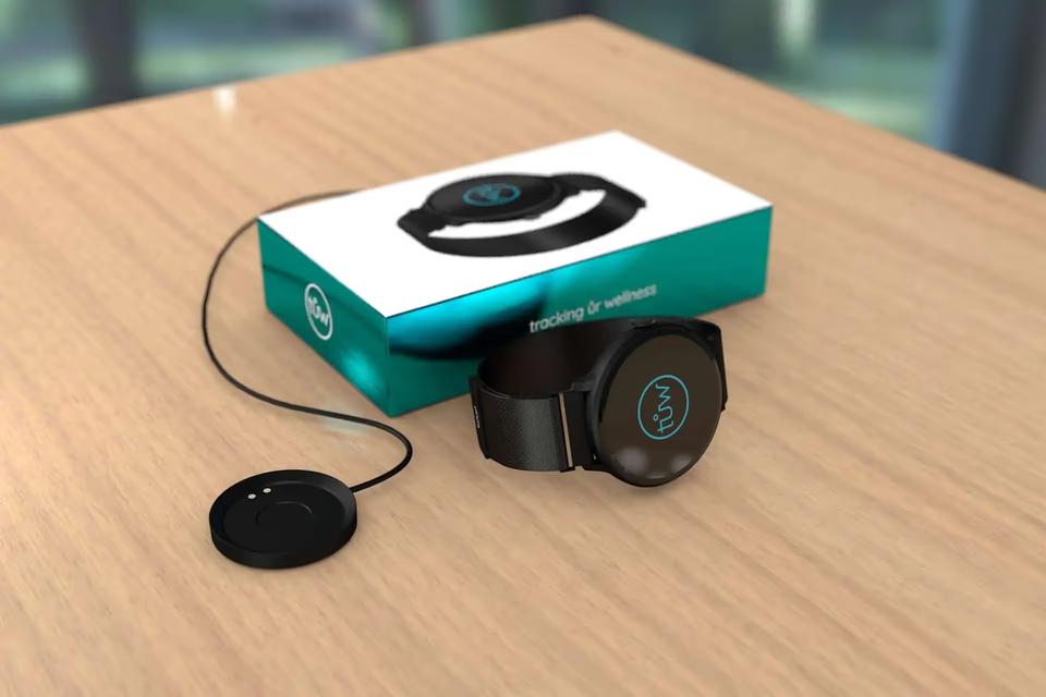
Health monitoring smart band design brought product vision, visual identity and UX strategy together in our 2016 work on Helo LX+ for Helo by World Global Network. The project connected wearable technology with a premium lifestyle aesthetic and clear communication around personal well-being.
ADR Studio developed the design vision and product communication for a smart band intended to track vital signs and support user well-being. The challenge was to communicate trust, health innovation and everyday relevance in a crowded wearables market.
Read as a showreel, the story moves from that central challenge to a coherent product identity. The focus is not a sequence of documented prototypes. It is the progression of the design idea: what the band needed to communicate, how its identity could express that, and how the finished concept could sit within everyday life.
Where did the Helo LX+ design story begin?
Everything starts from a dot. For Helo LX+, that starting point was a relationship: technology collecting health information, and a person trying to understand its relevance. The design brief asked us to bring those two sides closer through simplicity, reliability and lifestyle integration.
A wearable occupies a particular place in product design. It is a technology product, but it is also something worn on the body. Its identity has to speak about capability without reducing the person wearing it to a set of readings.
That tension gave the project its direction. Helo LX+ needed to communicate health innovation while remaining approachable as a personal object. The premium lifestyle aesthetic was part of that balance, connecting the technology proposition to the experience of wearing and living with the product.
How does health monitoring smart band design build trust?
In this project, trust was a communication objective. Clear visual identity and UX strategy were intended to make the health technology proposition easier to understand. They gave the product a consistent way to present itself, rather than relying on technical capability alone.
There is an important distinction here. Design can communicate reliability and help people understand information. It cannot, by itself, establish the accuracy of a health measurement. The design story is about clarity and confidence in the experience, not a claim of clinical validation.
The brief brought three priorities into focus:
- Simplicity. Make the relationship between the product, its purpose and personal well-being clear.
- Reliability. Express a consistent identity across the product proposition and its communication.
- Integration. Present wearable technology as part of everyday life, not as a separate technical world.
Together, these priorities connected the design language to the campaign. Each had a role in making the same proposition understandable.
How did the idea become a design language?
The next chapter is the move from intention to expression. ADR Studio developed a design language that brought health and technology into a shared identity. The aim was a refined smart band proposition, supported by intuitive branding rather than competing messages.
Systems, not styles. Here, that means reading product vision, branding, UX strategy and communication as connected parts of the work. A lifestyle image and a product message serve different purposes, but they should not suggest different products.
The premium aesthetic therefore had a strategic role. It placed Helo LX+ within a lifestyle context while the messaging kept personal well-being in view. Neither side needed to disappear: the technology remained central, and the identity gave it a more personal frame.
The craft of this relationship lies in coherence. Refinement is not simply a visual treatment. It is the discipline of making each expression support the same idea.
What connects the product vision to everyday life?
Lifestyle visuals helped bridge the product proposition and its intended place in daily life. They supported a view of Helo LX+ as a wearable for personal well-being, rather than presenting it only through its monitoring function.
This was not a reason to make the technology vague. Clear messaging remained part of the work. The product tracked vital signs; the communication needed to connect that function with the broader purpose of supporting well-being.
UX strategy belonged in the same conversation. In the project brief, it supported trust in health data alongside the visual identity. That places the experience of understanding information within the design vision, rather than treating it as separate from the brand.
The resulting direction brought together a refined identity, intuitive branding, lifestyle visuals and focused messaging. These were different expressions of one proposition: health technology with a place in personal life.
How can the project be read as a showreel?
A showreel-style reading gives the work a clear sequence without inventing sketches, clay models or production stages. The story can be understood through four connected chapters:
- The context. A crowded wearables market and a brief to communicate trust, innovation and lifestyle integration.
- The idea. Bring wearable technology and a premium lifestyle aesthetic into the same design vision.
- The expression. Connect the design language with branding, UX strategy, lifestyle visuals and clear messaging.
- The finished direction. Present Helo LX+ at the intersection of technology and wellness.
The movement is from purpose to expression, not simply from an unfinished object to a polished one. That distinction matters because the project covered both design vision and product communication.
Helo LX+ helped expand adoption globally and elevate brand perception in the digital health sector. Those are qualitative outcomes in the project account. They provide context for the work without implying a measured contribution from any single design decision.
Key takeaways.
- ADR Studio developed the Helo LX+ design vision and product communication for Helo by World Global Network in 2016.
- The direction merged wearable technology with a premium lifestyle aesthetic centred on personal well-being.
- Visual identity, UX strategy and clear messaging worked toward a shared communication goal: trust.
- The project connected product and campaign through a coherent design language, rather than treating them as separate expressions.
FAQ.
What was ADR Studio’s role in Helo LX+?
We developed the design vision and product communication. The work brought together design language, visual identity, UX strategy, lifestyle visuals and messaging for the health monitoring smart band.
What was the main design challenge?
The challenge was to communicate trust, health innovation and lifestyle integration in a crowded wearables market. Simplicity and reliability guided the direction, alongside a premium aesthetic.
Does this story document physical prototypes?
No. It presents the progression from brief to design direction as an editorial sequence. The available project account does not document sketches, clay models, wireframes or specific prototyping methods.