 By Antonio De Rosa, ADR Studio.

A multi-channel brand design system connects different experiences through a shared visual language. For Vyvo in 2017, we brought packaging, a responsive website, UI elements, video and business tools into one coordinated design suite. The aim was clear: give the brand a consistent presence without making every format behave the same way.
What did Vyvo need its brand to do?
The brief was broader than a single product presentation or website. Vyvo asked ADR Studio to elevate its brand across physical and digital settings. Packaging needed to belong to the same world as a sales presentation. Video needed to reinforce the identity expressed through the website and its interface elements.
Each format had a different role. Together, they needed to communicate one brand. The challenge was to make that relationship clear while leaving room for different kinds of use, from encountering a package to navigating a screen or following a business presentation.
That balance shaped the project: a flexible, recognisable system rather than a collection of separate designs. Consistency was not an extra layer added at the end. It was the organising idea connecting the work.
How does a multi-channel brand design system take shape?
Everything starts from a dot. Here, the starting point was the relationship between the parts. Before considering the finished suite, it helps to see the brief as a set of connected questions. What should remain familiar? What needs to change with the medium? How can each piece support the next?
The design task brought three concerns together: visual language, interaction principles and narrative voice. These are related, but they are not interchangeable. Appearance establishes recognition. Interaction shapes how someone uses a digital experience. Voice gives the communication a consistent point of view.
The system needed to hold those concerns together without forcing a package, interface and video into an identical arrangement. This is where the craft sits: knowing what to carry across and what to adapt.
- Visual language: connect packaging, screens and communications through a coherent identity.
- Interaction principles: make digital elements feel like part of the wider brand experience.
- Narrative voice: keep the brand’s communication aligned across marketing, business tools and multimedia.
- Flexibility: support different formats and user needs without losing recognition.
What would a showreel of the project reveal?
Read as a showreel, the project is a movement from individual pieces to a connected whole. The story is not simply a sequence of finished designs. It is the growing recognition that each piece belongs to the same system.
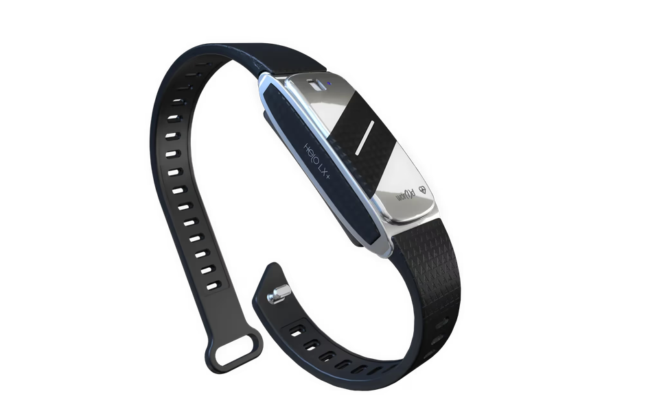
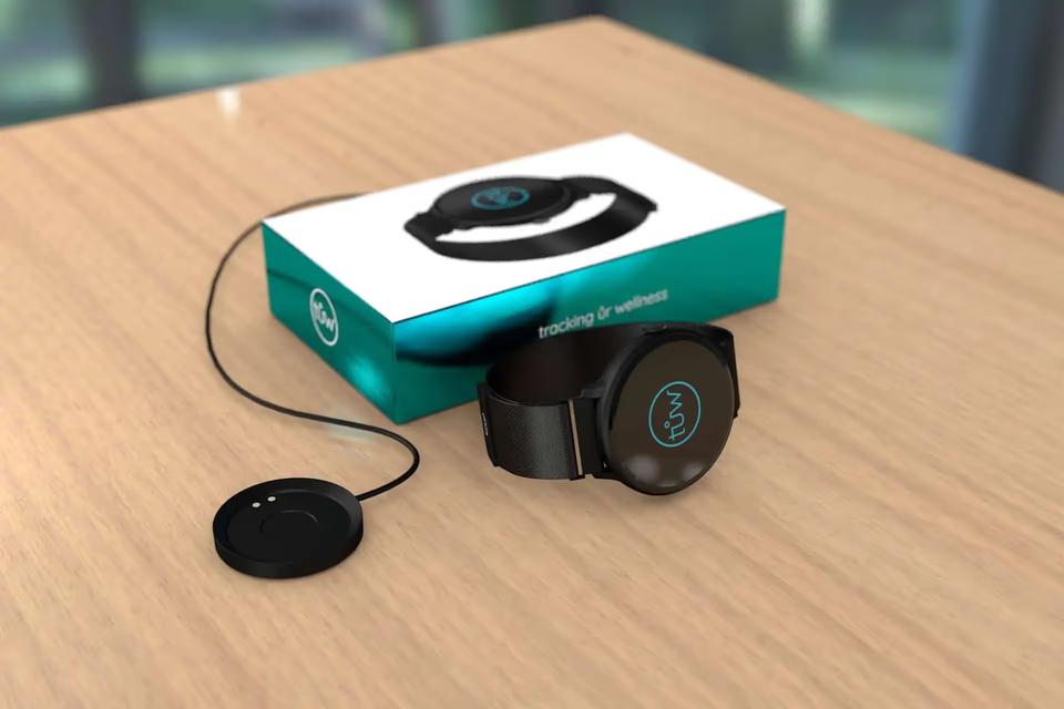
Packaging introduces the physical expression. The website shifts the experience to a responsive digital setting. UI components bring the focus closer, to the elements through which people interact. Video adds movement and narrative. Presentations and sales collateral carry that identity into business communication.
This is a way to read the work, rather than a claim about its production order. The sequence makes the central idea visible: the medium changes, but the brand should not feel as though it starts again.
The final view is therefore wider than any individual application. It shows a coordinated design suite whose parts support one another. What matters is both the quality of each piece and the continuity between them.
How do packaging and digital design stay connected?
Physical packaging and digital experiences ask different things of design. A package has a defined physical presence. A responsive website must work across different screen sizes. UI elements must support interaction, not just appearance. Their connection depends on shared principles, not a repeated layout.
For Vyvo, refined packaging, a responsive website and dynamic UI components were all part of the same scope. Treating them as related expressions gave the project a clear direction: maintain a recognisable identity while respecting what each format needs to do.
The transition matters. Someone moving from a physical product experience to a digital one should encounter a coherent brand, rather than unrelated visual decisions. That continuity was a central goal of the project.
Systems, not styles. A style can describe how something looks in one setting. A system also considers how its identity carries into another. Vyvo’s brief required that wider view because the work spanned both objects and interactions.
Where do video and business tools fit?
Video and business tools were not secondary applications. They were part of the brand’s everyday communication. The scope included multimedia video content, presentations and sales collateral, alongside the website, packaging and UI work.
These formats create different demands. Video can organise a story over time. A presentation needs to guide an audience through information. Sales collateral needs to communicate within its own format. A coherent system supports those differences while keeping the source of the message recognisable.
Scalable business tools also extend the value of the design beyond a single finished piece. The brief called for tools that could support varied uses while remaining aligned with Vyvo’s strategic brand goals.
Seen together, these applications explain why the project was an ecosystem rather than a standalone identity exercise. The brand needed to work wherever it appeared, including the practical materials used to explain and present it.
What did the finished design suite bring together?
The finished suite connected refined packaging, dynamic UI components, a responsive website, multimedia video content and scalable business tools. Each addressed a distinct need. Together, they created a polished, harmonious experience across physical and digital settings.
The project’s stated benefits were greater clarity, stronger engagement and a more recognisable brand presence. No performance figures are provided, so those benefits should not be read as measured claims. The concrete result is the integrated suite and its alignment around a common brand direction.
For us, the story is in that connection. Design drives performance by giving communication a clear structure and a consistent foundation. In this project, the work was to make many expressions feel like one brand, without removing their individual purpose.
Key takeaways.
- Vyvo’s 2017 brief connected packaging, digital experiences, video and business communication.
- A shared visual language, interaction principles and narrative voice gave the suite a common foundation.
- Consistency meant adapting the identity to each medium, not repeating one layout everywhere.
- The finished work formed an integrated brand ecosystem rather than a set of isolated assets.
FAQ.
What did ADR Studio design for Vyvo in 2017?
The project covered packaging, marketing and business tools, including presentations and sales collateral, a responsive website, video content and UI elements. These formed a coordinated suite aligned with Vyvo’s brand goals.
Why did Vyvo need a connected brand system?
The brand needed a consistent presence across physical and digital experiences. A flexible system could support different uses while maintaining a recognisable visual language and coherent communication.
Does brand consistency mean every application looks the same?
No. Packaging, websites, interfaces and video serve different purposes. The aim is to preserve recognition across those differences, giving each format the freedom to work while keeping it connected to the whole.